Maximalism may be of the moment, but the appeal of a pale interior has never gone away thanks to the top designers making a feature of white
Originally featured on Christie’s Luxury Defined Blog.
Twenty-five years ago, when helping her boyfriend decorate his first home in London, Chrissie Rucker had a lightbulb moment. Faced with myriad colour choices, she decided to go all white. “It struck me that white in the home is like the perfect little black dress,” she says now. “It’s simple yet effortlessly stylish, modern yet classic. It also has a magical, calming, spa-like quality—and it just works.”
White can be both calming and effortlessly stylish, says Chrissie Rucker, founder of The White Company. Image: Chris Everard (taken from For the Love of White: The White & Neutral Home by Chrissie Rucker & The White Company, octopusbooks.co.uk)
Rucker subsequently channeled this ethos to create The White Company, a retail business that, as the name suggests, sells all-white products for the home, plus fashion. In so doing she struck a chord, for today The White Company has a profit in the many millions, its online business operating alongside bricks-and-mortar stores around the globe that include flagship boutiques on New York’s Fifth Avenue and near London’s Sloane Square, plus a pop-up in The Hamptons.
She continues to be a dedicated follower of white and her three homes are decorated in varying shades of the colour. “White doesn’t date, it’s timeless and classic, and wonderfully versatile,” says Rucker, who is now married to her then boyfriend, Nick Wheeler, founder of Charles Tyrwhitt shirt maker. “White makes rooms feel airy and relaxed; it also accentuates architectural details, moldings, and woodwork.”
Australian architect and designer Jeremy Bull names white as a favourite colour—using it to great effect in Palm Beach House, a waterfront holiday villa in Sydney.
Scott Sloat, a partner in the New York-based interior design and renovation firm David Kleinberg Design Associates, is also enthusiastic about white. “A shade of white lends itself to a wide range of design—modern, traditional, and anything in-between,” he says. “I love using tones of white as a neutral background for an interior; it creates serenity, and gives a good grounding that then allows you to throw in a few more playful or bold colours on smaller pieces that are easy to swap out as your taste changes.”
For Australian architect and designer Jeremy Bull of Alexander &Co., white is much more than a backdrop to a home: “Simplicity, space, and time are the hallmarks of timelessness and ultimately luxury. Nothing recruits these emotions better than our favourite colour, white. In all it’s wonderful variation and idiosyncrasy, there are few things that we have not been able to achieve architecturally with this magnificent tool.”
“White makes rooms feel airy and relaxed; it also accentuates architectural details, moldings, and woodwork”
—Chrissie Rucker
The Perfect Canvas
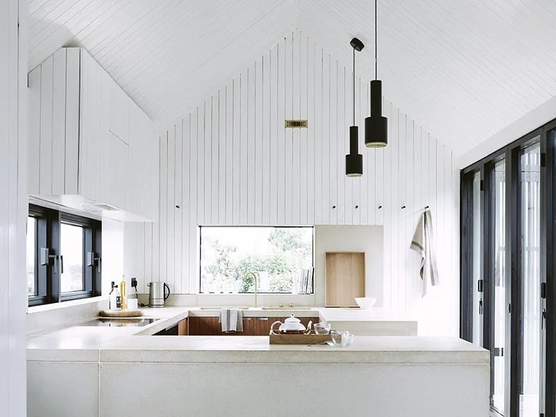
Despite the current popularity of maximalism, white remains synonymous with a contemporary interior—the global trend for Scandinavian-style interiors that feature a clean, pared-back aesthetic of pale walls and blonde woods is the most recent incarnation. For Brooklyn-based designer Michael Yarinsky, white adds balance, a crucial design element. “A room full of colour feels very loud, whereas white is like the negative space on a canvas—it gives you space to breathe,” he says.
Designer Michael Yarinsky used white in this home renovation to create “an uplifting space that feels happy and bright.” Image: Charlie Schuck
However, it is only over the last century that white has become sought after. Iconic American interior designer Elsie de Wolfe created a design sensation in 1907 when decorating the headquarters of the exclusive Colony Club, New York’s first women-only private members’ club. Using pale tones, she introduced a freshness to interiors that had not been seen before. Twenty years later, in London, leading interior designer Syrie Maugham created a “smiling, shimmering all-white” drawing room in her own home that became a magnet for the beau monde.
Neither of these rooms used pure white, however—it wasn’t until the 1940s, with the addition of the chemical compound titanium dioxide into white pigments, that it became possible to create brilliant whites.
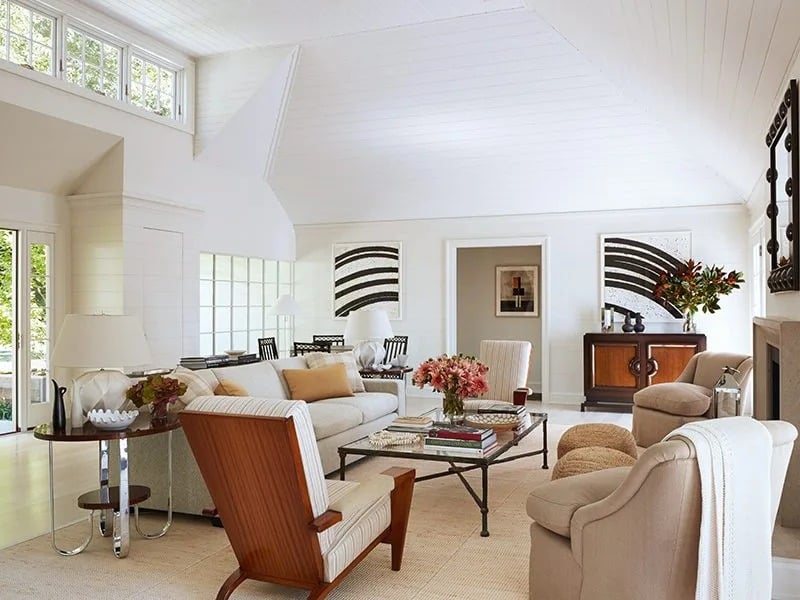
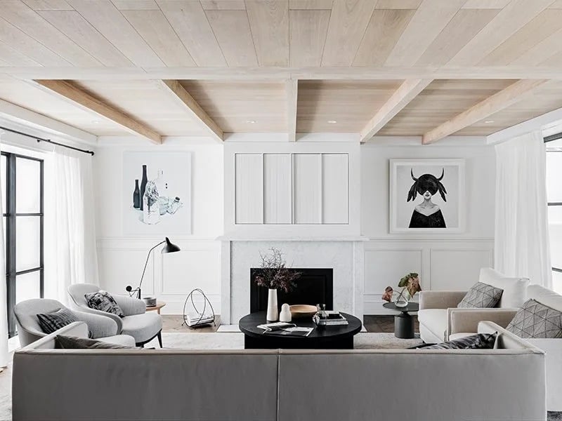
New York’s David Kleinberg Design Associates use layered tones of white, cream, and brown to create a warm, sophisticated feel.
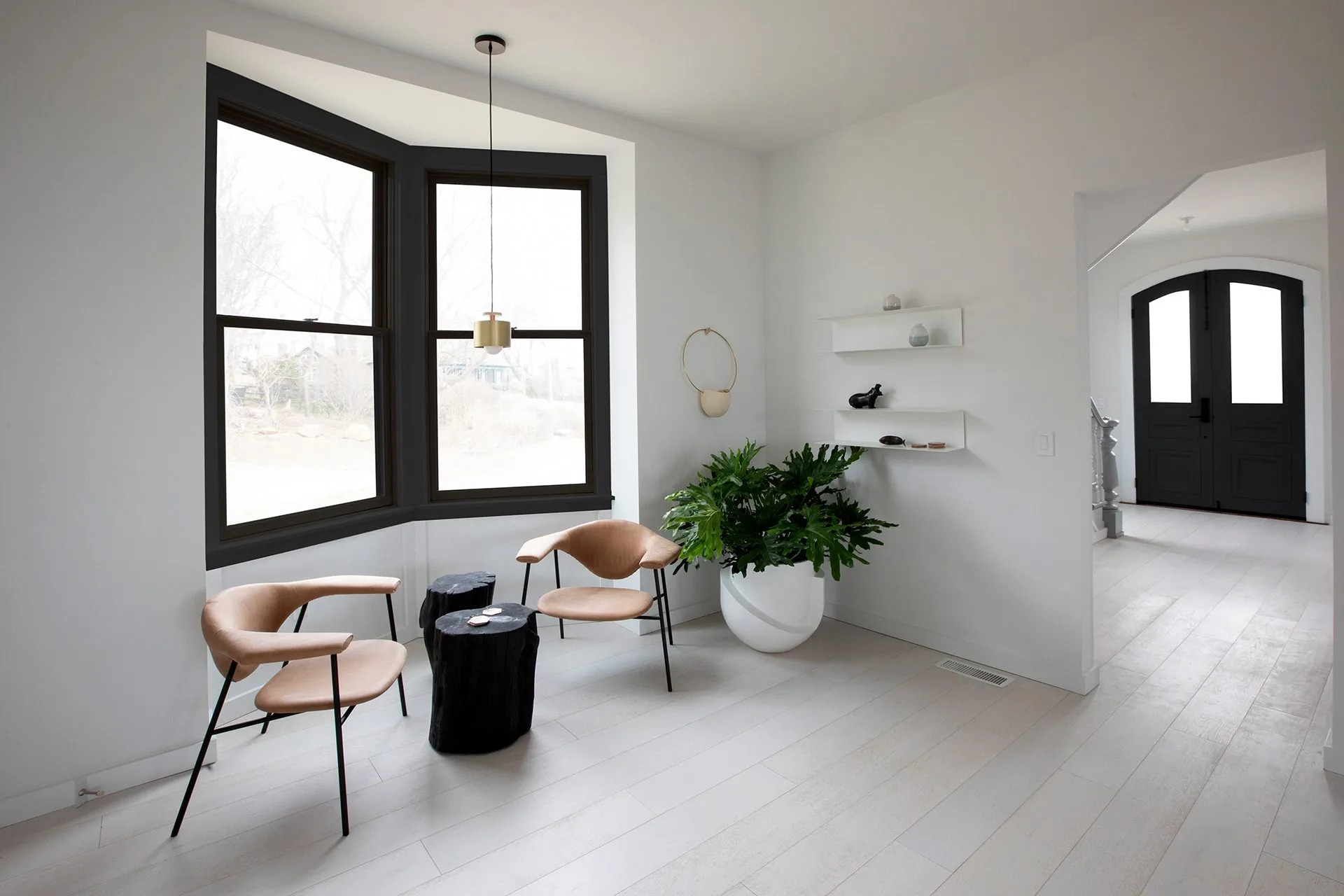
Tonal Approach
A white interior, though, comes with a note of caution; it needs to be handled carefully to avoid a space that feels sterile and cold. “I would never do a single white on everything in a room—it would be too clinical and artificial,” says Sloat. “You can have a ‘white’ room but it’s made up of tones of white, ivory, bisque, cream… It’s the layering that will create a highly sophisticated palette and keep a room interesting and inviting.”
“A room full of colour feels very loud, whereas white is like the negative space on a canvas: it gives you space to breathe“
—Michael Yarinsky
“When decorating with white, choose a soft, soothing palette of warm whites, off-whites, and neutrals, remembering that white is not one colour but a thousand tones and shades, all subtly different from each other,” advises Rucker. “Start with warm white—I like Farrow & Ball’s All White, and then choose different shades for different rooms. Also opt for a chalky texture rather than shiny as it is more matt and tactile.”
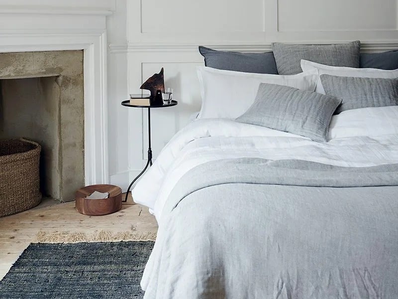
Rucker advises introducing cool grays and piling on the texture, keeping whites inviting—not clinical. Image: Chris Everard (taken from For the Love of White: The White & Neutral Home by Chrissie Rucker & The White Company, octopusbooks.co.uk)
Sloat’s favorite whites for walls include Benjamin Moore’s Wind’s Breath OC-24 or Fog Mist OC-31 in an eggshell finish. “They are not too beige or too gray; both have this wonderful quality, almost luminescent, and their color shifts a bit through the day as the light changes. And I accentuate trim with White Dove OC-17 in a satin finish. It’s crisp but not cold.”
For a home on Long Island Sound, Yarinsky deliberately chose a cool white, a blue/gray shade that references the colour of the surrounding water. “It’s not daylight that makes a white room feel cold, it’s trying to mimic daylight with lighting that does that,” he says. “We always use warmer schemes, with a colour temperature range of 400–2,700 Kelvin; a range of 3,000–4,000 Kelvin will make a room feel like a hospital.”
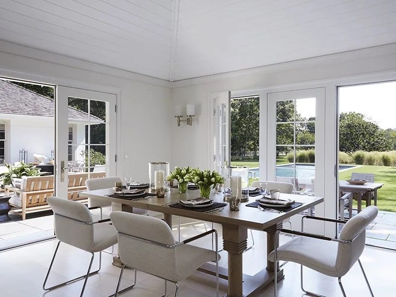
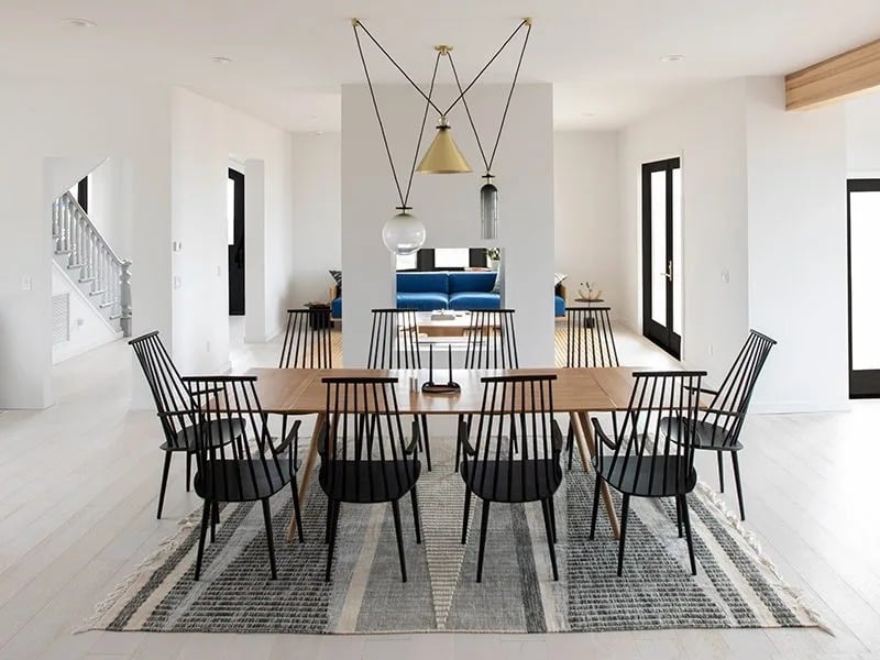
Minimalist design and pale interiors help to bring the outside in, such as in this dining space by David Kleinberg Design Associates.
While Rucker acknowledges that white works superbly as a foil to bright colors, she prefers to team her whites with other neutrals. “I layer in natural elements and pile on texture,” she says. “A soft rug or a diaphanous drape can soften and transform a room. She also introduces green. “I love to bring some outside in—a big vase of simple greenery or flowers add life.”
Yarinsky uses colour to create an almost sculptural look. “Blacks and charcoal grays, great greens, and right now, burgundy, are all moody colours that give a contrast and help capture the essential vibe that people want—an uplifting space that feels happy and bright.”
Banner image: Atherton Pavilions designed by Feldman Architecture. Courtesy: Adam Rouse
Check out this article next